Responsive website
Designed phone-first, then scaled carefully for tablets and desktops.
A moody, appetite-first one-pager that turns late-night browsers into table enquiries.
The challenge
Ember & Oak relied on phone calls and a PDF menu buried on social media. Diners on their phones could not easily read the menu, check opening hours, or ask for a table.
What we built
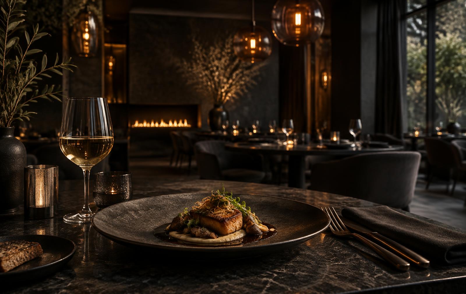
A cinematic one-page concept where the menu reads beautifully on any phone, a table-enquiry form is always close by, and directions plus hours stay one tap away. Warm photography and deep charcoal tones mirror the imagined dining room.
Deliverables
Designed phone-first, then scaled carefully for tablets and desktops.
Courses, tasting menus, and a wine list in clean, readable sections.
A focused request form designed to reduce missed calls during service.
Directions, parking notes, and holiday hours kept easy to find.
Full-bleed dishes and interiors that establish the atmosphere.
Clear titles, descriptions, and structure for local discovery.
Steps from brief to launch
Crafted sections
Device classes tested
“We designed every section to be comfortably read on a phone, because that is often where diners make their decision.”